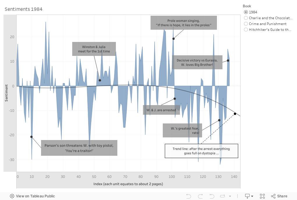
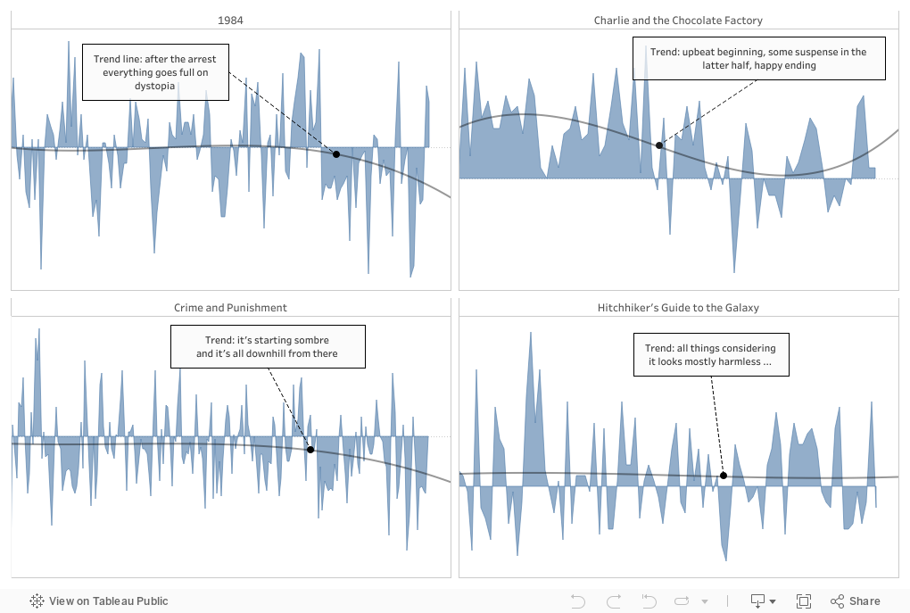
Below you'll find various different charts & plots I created with Tableau, using the data I extracted from my text sentiment analyses. Simply scroll down and enjoy!
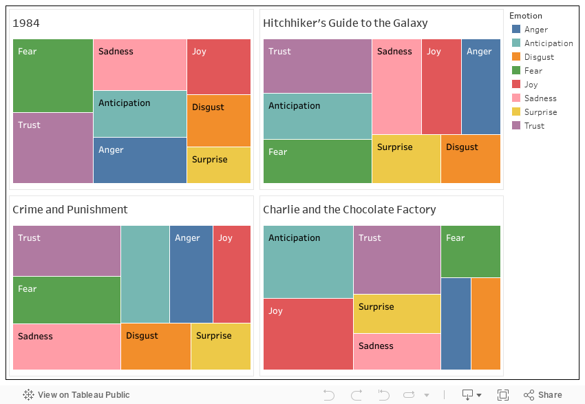
Below an overview of emotions within each of the books (according to the NRC dictionary).
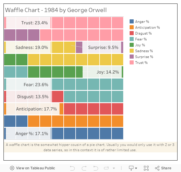
What you can notice here is that "Trust" overall makes up a large portion. One reason might be the specific vocabulary being used, especially in 1984 - so for example frequent words such as "police", "ministry" or "comrade" are being associated with the emotion "trust". The same applies to "Hitchhiker's Guide to the Galaxy" with frequent words like "inifinity", "sun" and of course "guide", all of which are also associated with the emotion "trust".
You can click on the items in the legend to highlight a particular emotion in the treemaps.
A waffle chart showing the distribution of the emotions in 1984 by George Orwell.
You can click on the items in the legend to highlight a particular emotion in the waffle chart.
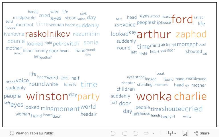
Below you can see text clouds, so visualisations of the most frequent words per book (excluding stopwords).